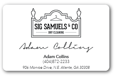
When I placed the logo within the shape of the normal rectangle I felt like they were fighting each other...
I went on to just take elements out of the logo (not sure if its allowed) and it feels cleaner and it nests better.
I also like the die cut idea. This would be great if I could get it cut perfectly. It wont be incredibly practical though. It will probably tear. We will see. Fingers are crossed...


The shape of the logo is pretty iconic, especially since it's based on the actual building. It would be nice if you could still utilize it. I do like the cut out idea, but I would also worry about it being too frail and easily ripped. What about keeping the majority of the shape, but losing those two finials on top? I think that would eliminate the problem and still keep the overall feel of the logo.
ReplyDelete