Wednesday, February 26, 2014

Business Card Development

Here are some starting ideas I had...

When I placed the logo within the shape of the normal rectangle  I felt like they were fighting each other...


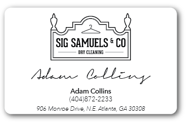
I went on to just take elements out of the logo (not sure if its allowed) and it feels cleaner and it nests better.  


I also like the die cut idea. This would be great if I could get it cut perfectly. It wont be incredibly practical though. It will probably tear. We will see. Fingers are crossed...


Sunday, February 23, 2014

Wednesday, February 19, 2014

Sig Samuels Brick and Mortar

This was the inspiration for the logo. The historic building shows the character and the longevity of the business.

sigsamuels.com

Tuesday, February 11, 2014

More Color for Sig Samuels

I have softened the corners on the frame of the logo to give it a more approachable feel. I am also still working on color choices, but my biggest challenge I think will be the frame. On the actual building the bricks that make of the frame are white/marble, and I would like for that to be referenced in my logo..

Monday, February 10, 2014

Sig Samuels Logo Development

This is where I am on the logo development. This is the first attmept on color. It still has a long way to go... I still think it needs some of the fine details to add depth. I have added a fine line on the border. Im looking for inspiration from older antique logos. I just do not want to over do it.